Problem:
How do you create a consistent look at an event stand with three companies who don't share a common branding style?
Solution:
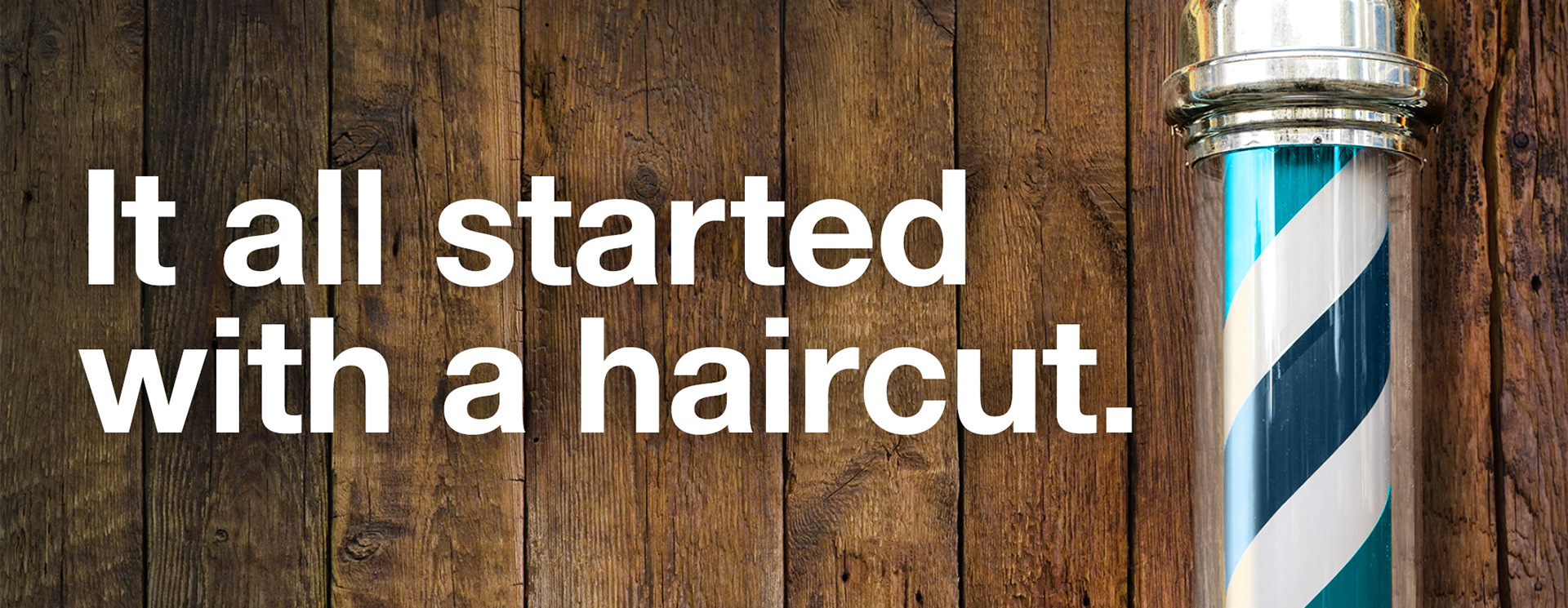
60 years ago The Pharmacy Guild of Australia started
more words to fill out
To speed up delivery and make everything easier, I utilised assets from Polyhaven and Turbosquid, including the barber chairs, parking meter, mirrors and car, while everything else was modelled by myself.
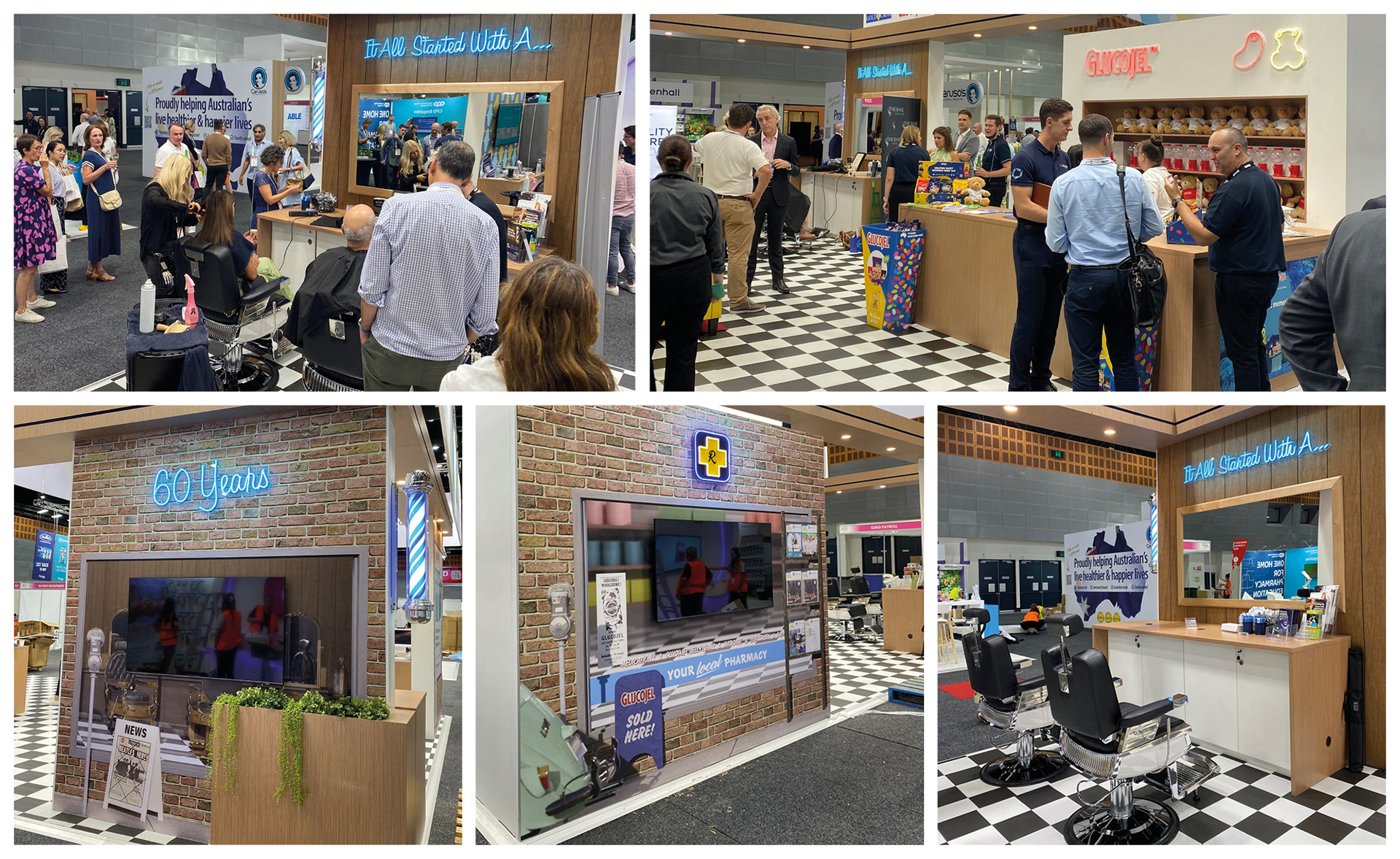
Photos by Guild event staff
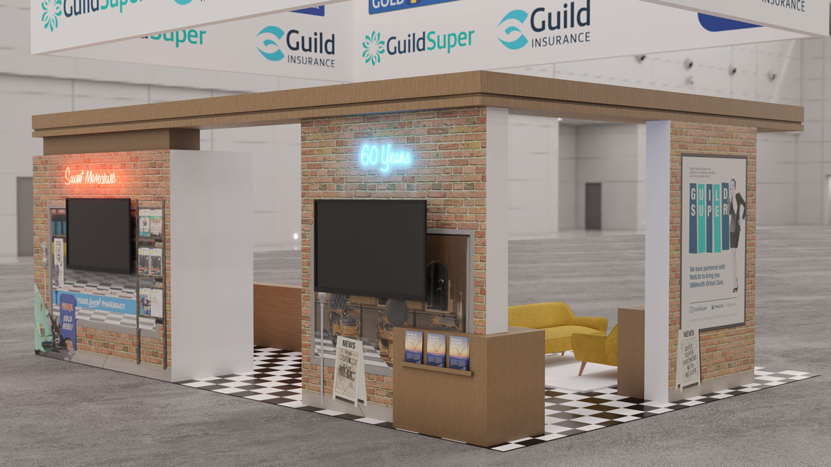
A mock-up of the panels as they would appear at the event stand.
Guild Insurance brochure for the event

The brochure I created to mark the 60 year anniversary of Guild Insurance.
I created a second brochure with similar styling, with neon on a barbershop wall, for other occasions. This theme was expanded to other shapes and sizes, which was no issue as I created the scene with modularity in mind. All the signs could be easily rearranged depending on the aspect ratio of the image needed.
close up of the scene in Blender.
The Stand Artwork
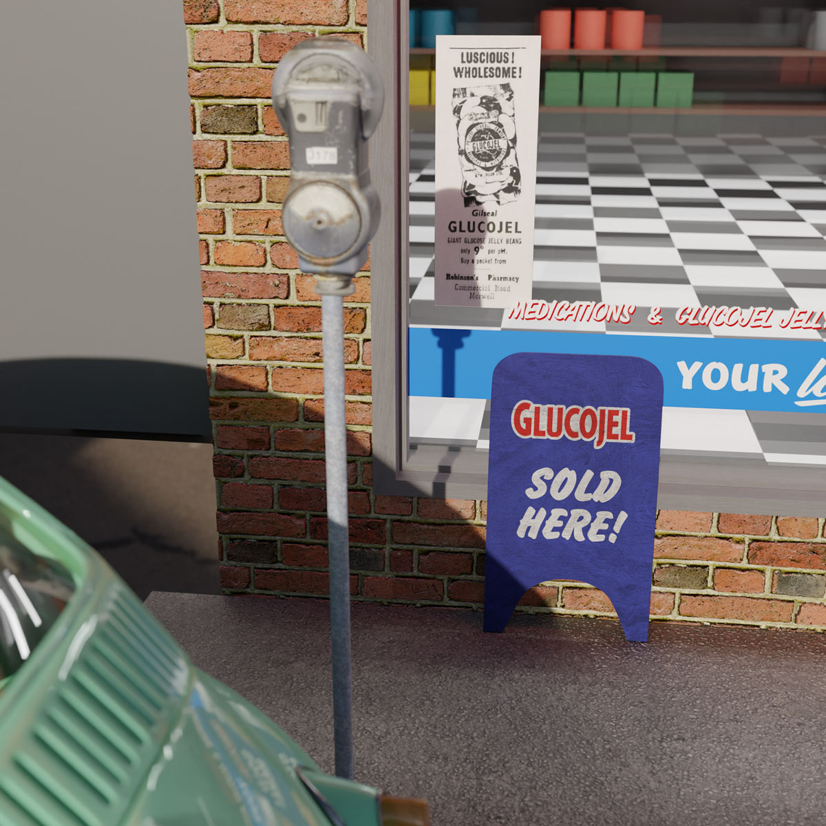
An old Glucojel newspaper ad was found, which I incorporated into the scene by blowing it up and sticking it to the window of the pharmacy. I matched the floor of the rooms in the window to the floor covering chosen by the event manager. Even to the point of measuring the width of the squares in the vinyl sample which was supplied and ensuring a match in scale to the virtual scene.
An old newspaper added to the scene to add an extra reference point to the era the stand is set in.
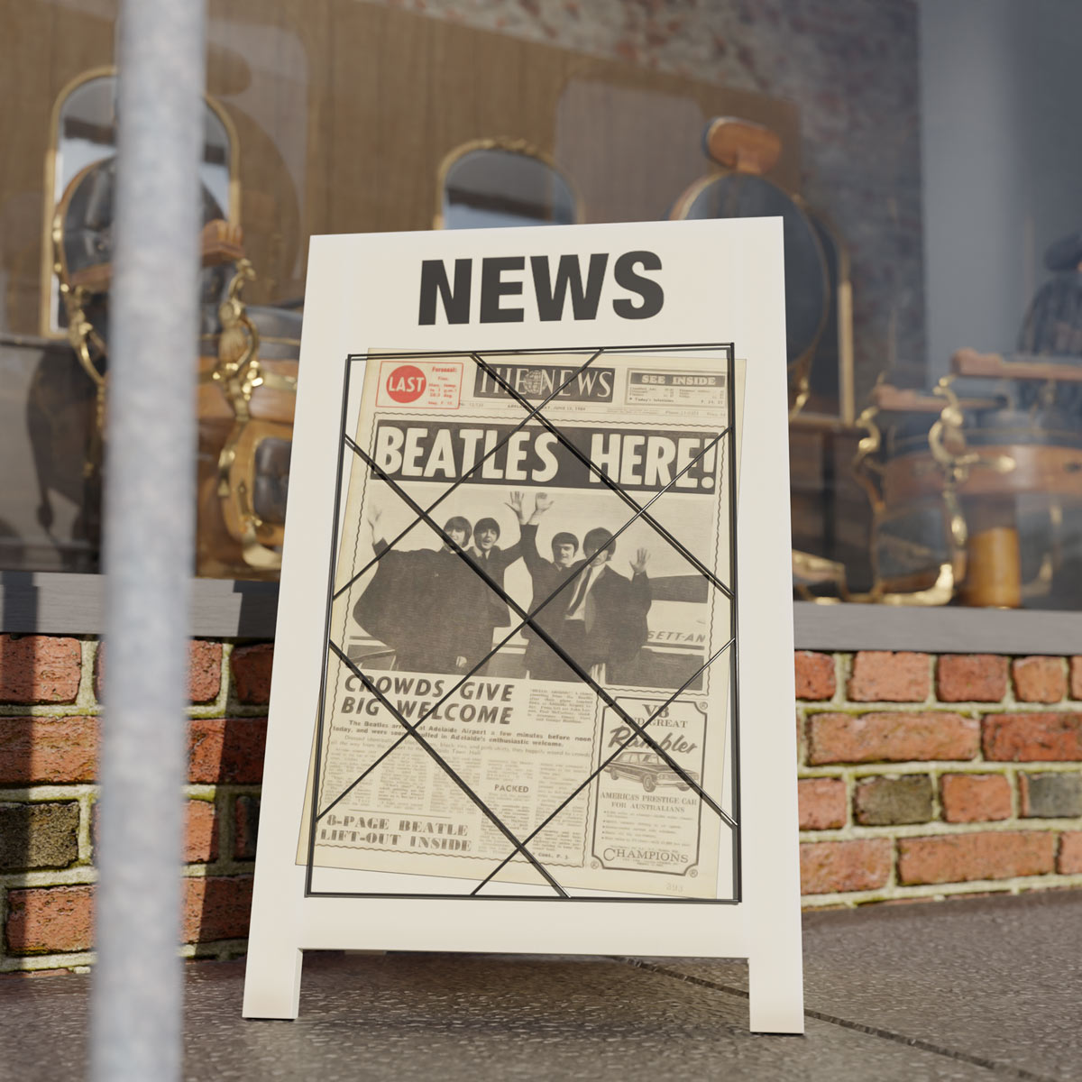
While Guild Super is part of the Guild Group, they have their own marketing team, colours and style. I had to come up with a way to incorporate those without making all 3 parts of the stand feel disconnected. I came up with a retro poster for them, and a newspaper frame to highlight the recent partnership they were wanting to promote.
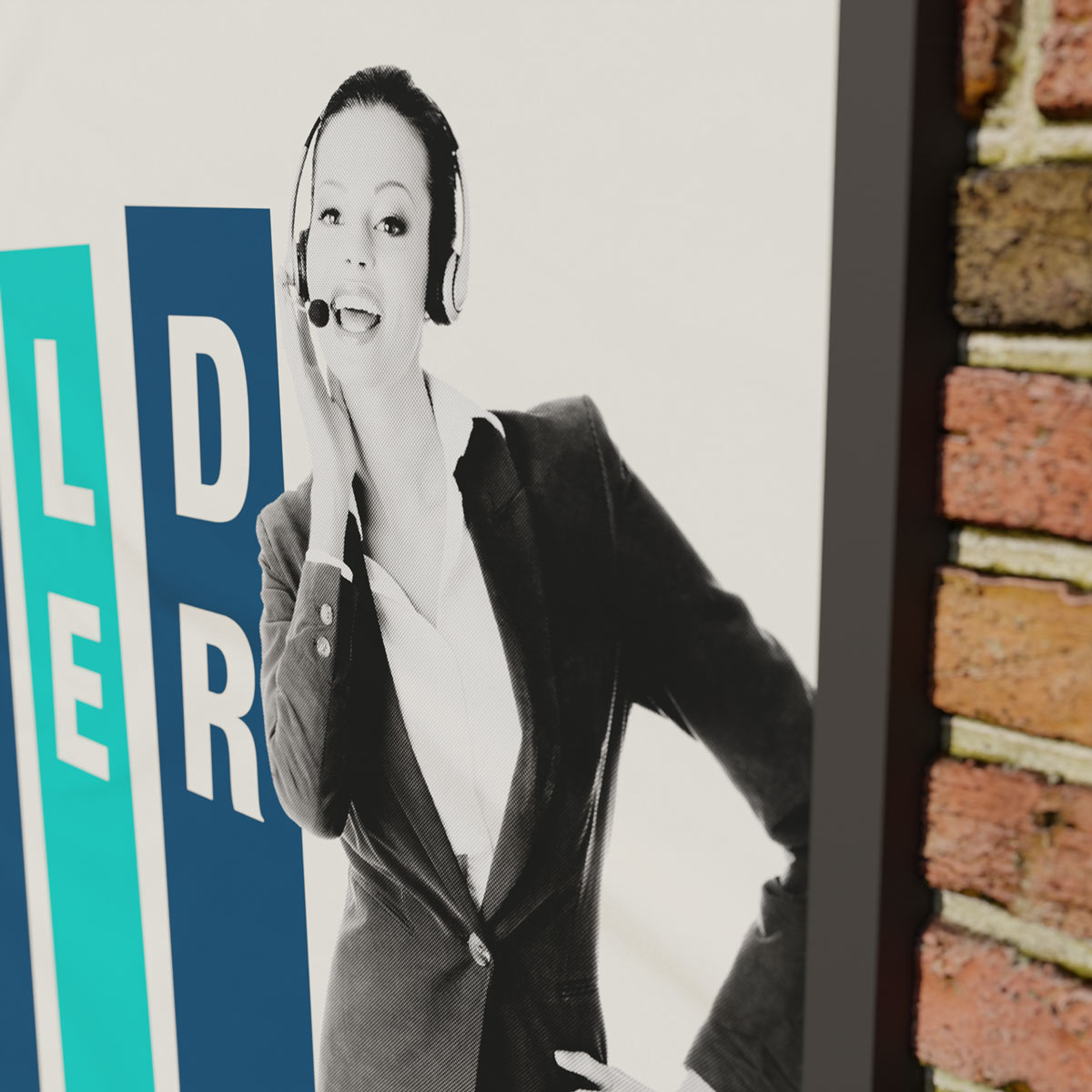
I went with a '2 spot colour graphic and halftone black photo' printing style for the poster, which was popular at the time.
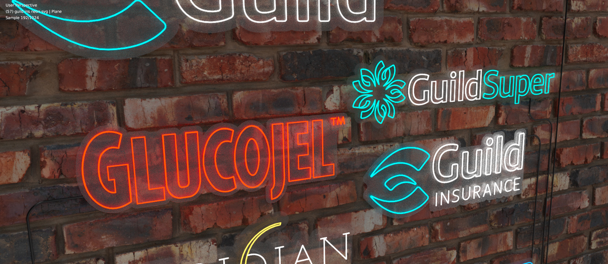
Neon
Some LED neon was created for the event stand. This was a few logos, text and Glucojel images - a bean and a bear. I converted the logos from filled shapes to single lines and recreated the font used to a single line shape (as single lengths of neon would be used to create the font, instead of an outline. I also supplied a larger outline for where the clear acrylic backing would be positioned.
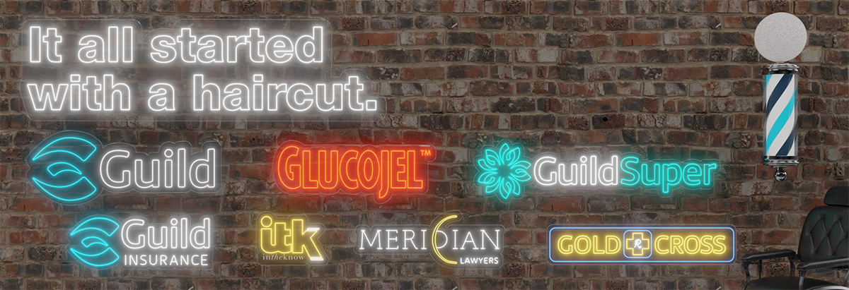
I created a scene in Blender for just neon that was used in other brochures, ads, and subsequent events for the year. This included more of the Guild Group's logos, and was a simple scene - making resizing and adding/removing logos an easy task.
Behind the Scenes
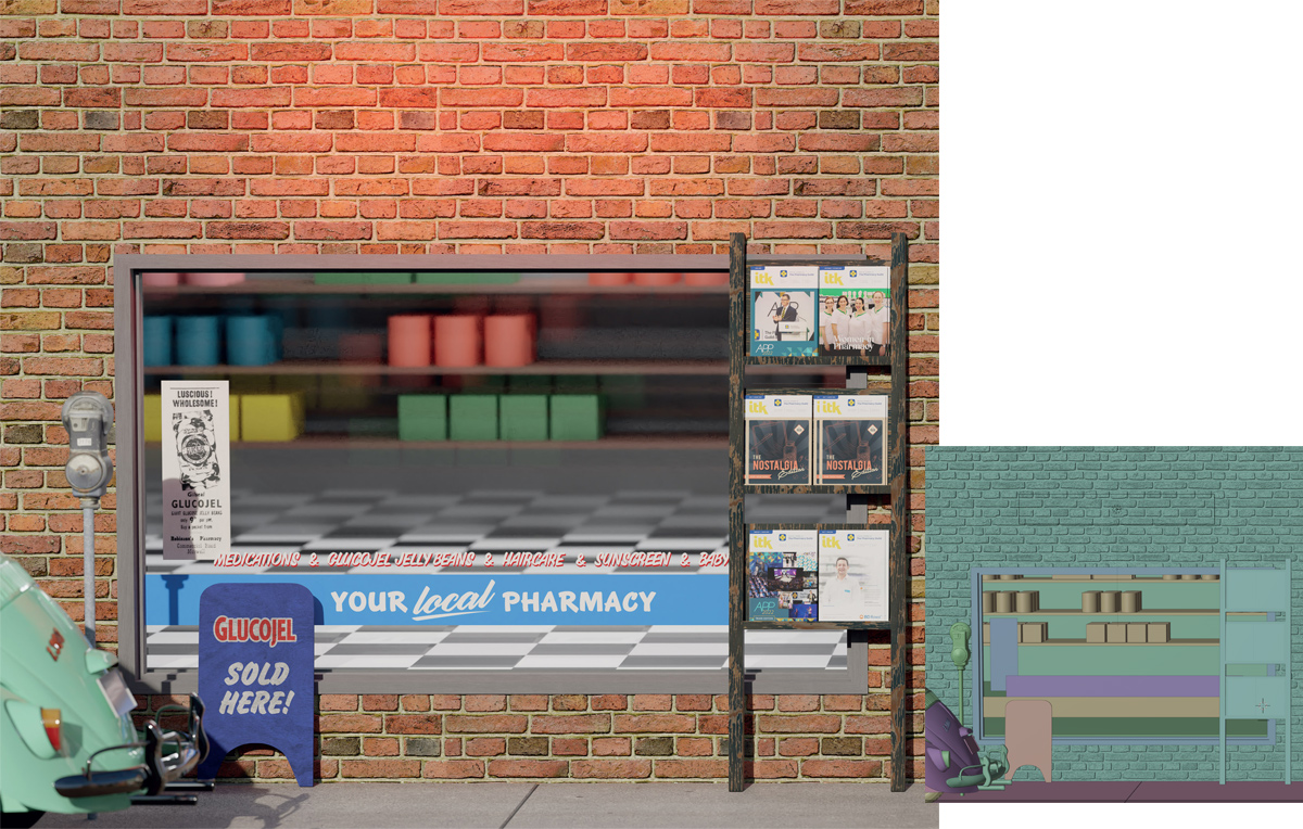
The first panel, featuring Glucojel and ITK magazine.
The top parts of the first and second panels would have some LED/neon signs, I added an extra glow on the walls enhance the connection to the lighting of the real world.
I didn't add too much detail to the shelves in the window as the middle section would be covered by a TV.
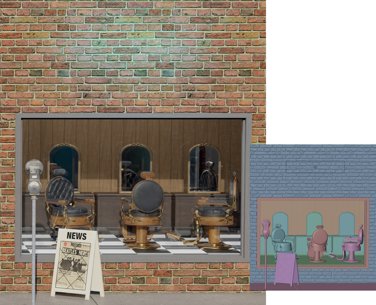
The second panel, showing links to the haircut where it all began.
The scenes were rendered with a slight tilt in the camera to capture the footpath, instead of being straight on.
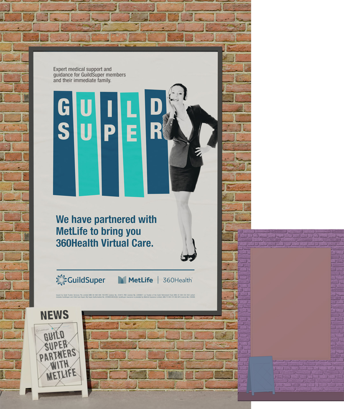
The third panel, featuring Guild Super and Metlife's 360Health.