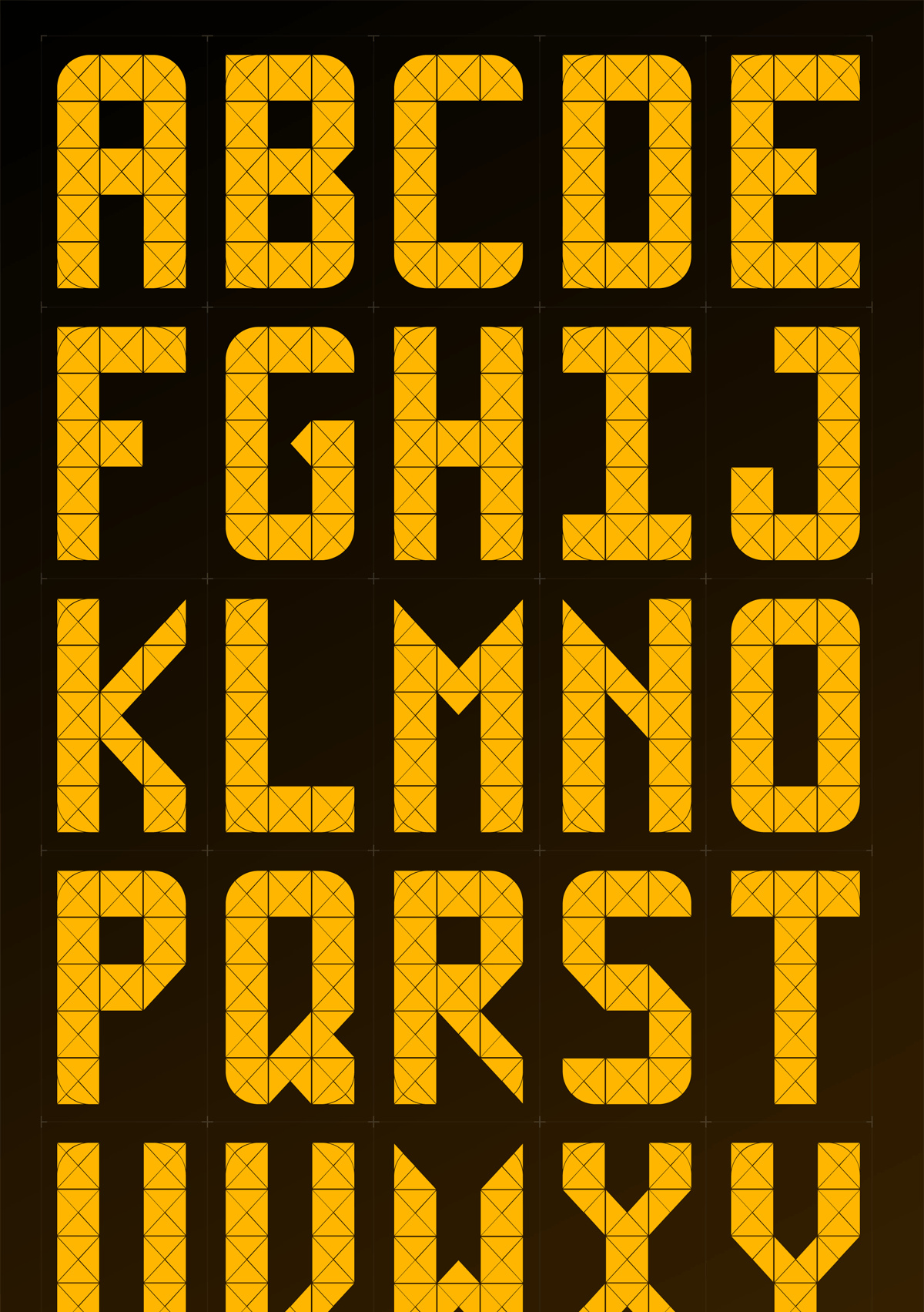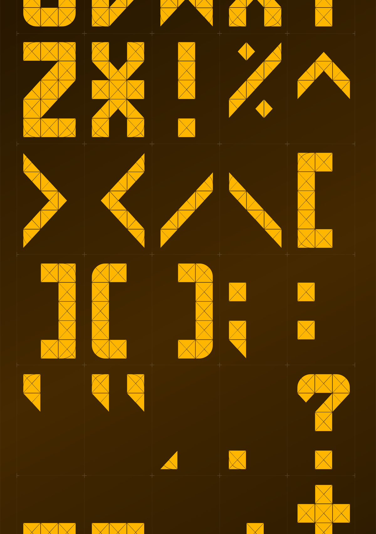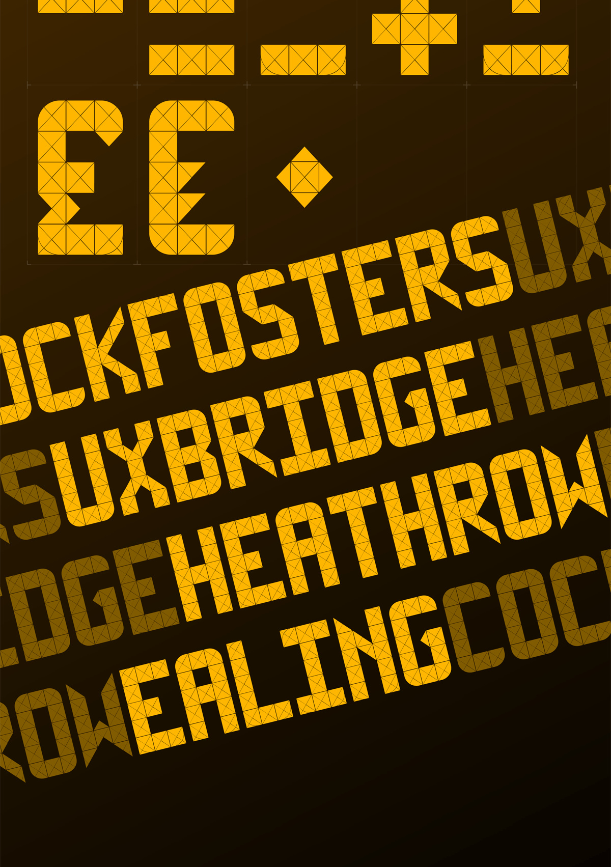
A typeface based on and extrapolated from the illuminated signage at the front of 1973 Piccadilly Line Underground trains.
A fun personal project to research and recreate a font that has interested me since first seeing it. Limited by square sections divided into 4 triangles, with additional curved sections in the corners, the LCD destination sign can create a wide variety of shapes.


The tools I used for this project were:
Adobe Illustrator: character shapes and a spot to keep reference images close by.
Glyphs: importing of shapes from Illustrator, setting of font properties like kerning pairs and other font information information.
