Problem: Guild Insurance insures people from all walks of life. From pharmacists and dentists, to fitness professionals and XXXX. There are professions where the general customer, understandably, won't want to read a whole brochure full of technical insurance jargon. They would rather XXX
Solution: Instead of sending out printed material we would create a digital version of our brochures just for the fitness market. Instead of still images and lots of words, we would include more imagery and motion, and emphasise the risks fitness professionals would be facing in their line of work and how we can help them.
Utilising a site called Shorthand, I created a scrolling page that changed backgrounds as they went through the digital version of a brochure.
The desktop version of the site.
Due to the nature of iFrames the view here may not represent the view on the actual site, especially on mobile.
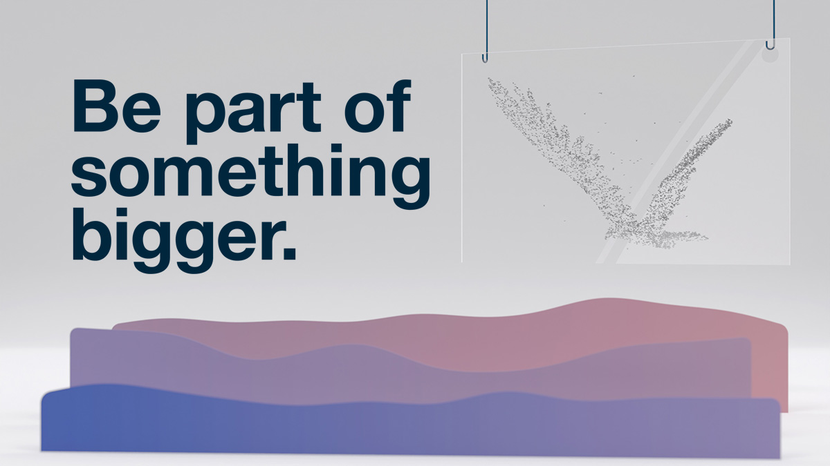
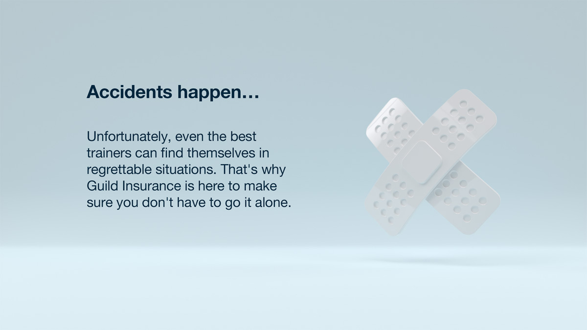
This initial background image is a simplified version of our Birds theme. Made to match the rest of the block colours in 3D style of the site.

Due to the urgent nature of the job, I utilised Adobe's Mixamo character and animation libraries. I found two characters suitable for a fitness theme and animations for the three case examples: squats, jogging backwards and running forwards.
I made backgrounds for both desktop and mobile, offset to the right so text could appear on the left.
While text was positioned to the middle-left, control over where it ends up is difficult due to the variable size of browsers.
I kept video backgrounds as light and low contrast as possible, to assist with readability, as the movement will detract even more.
Behind the Scenes
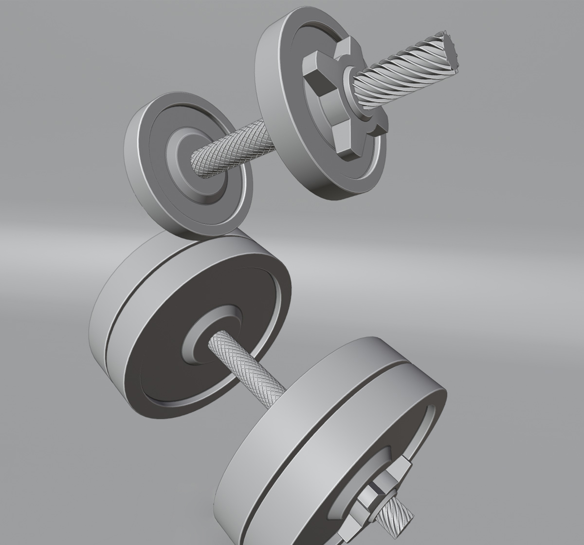
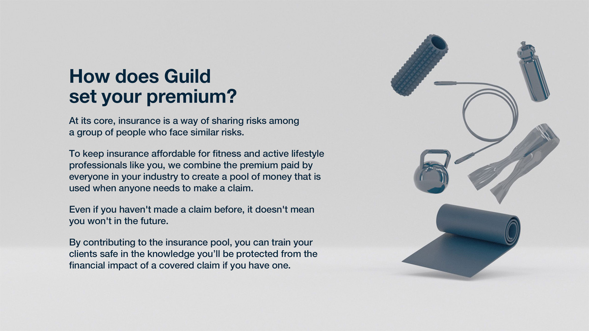
Details on the dumbbells I created. Just enough to look good but not so much it makes other items look un-detailed nor run over the deadline.
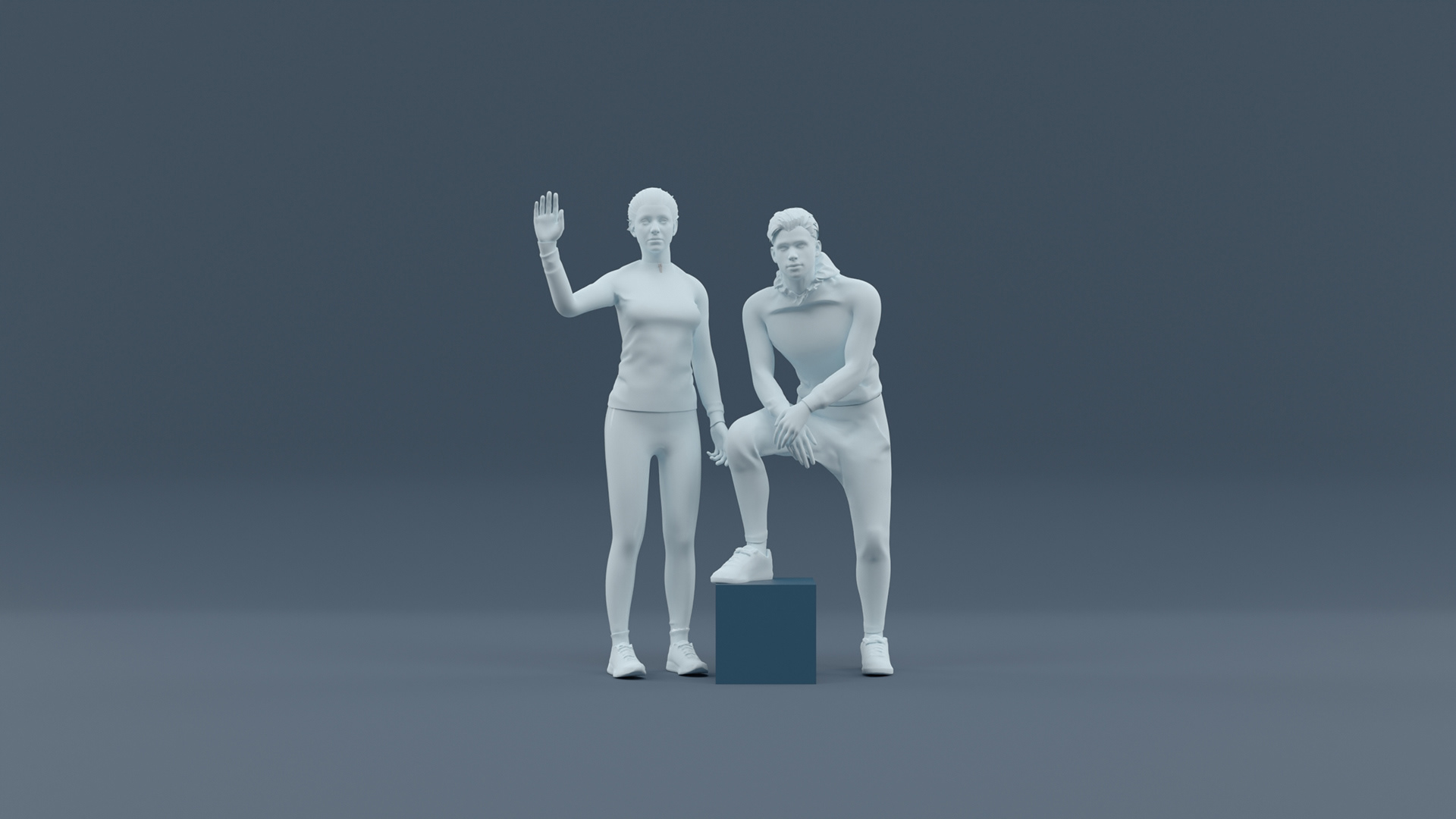
An unused scene, changed when copy for a new risk situation was supplied. Character from Mixamo.
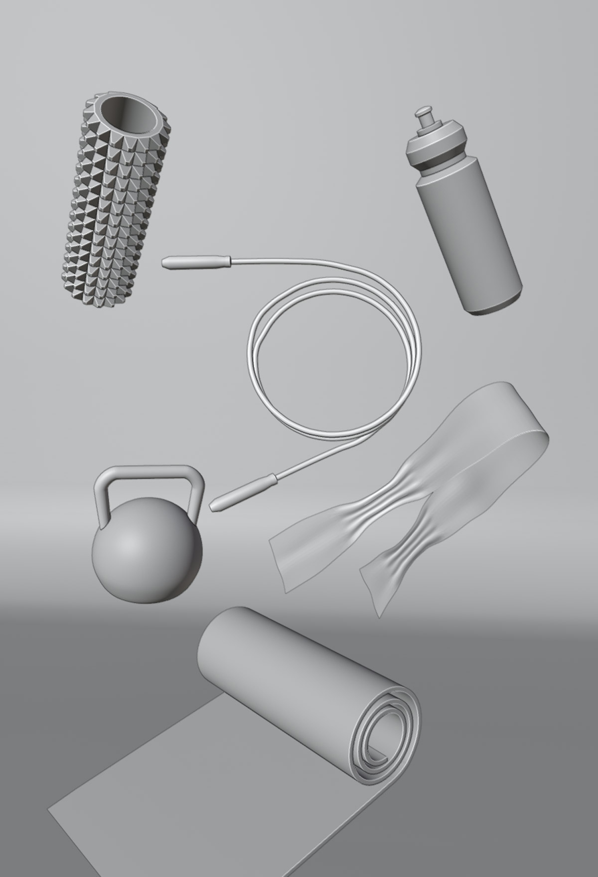
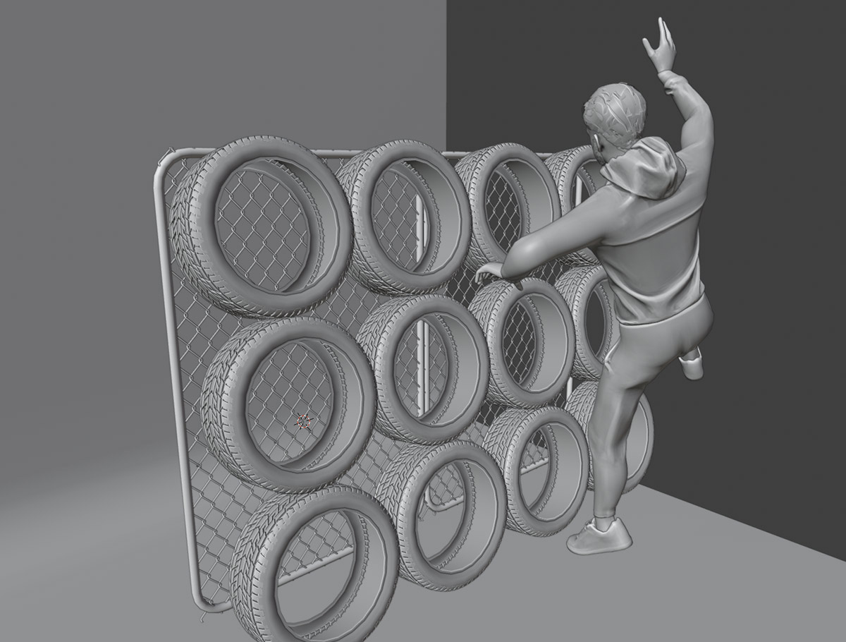
Some quick and easy to make fitness related objects.
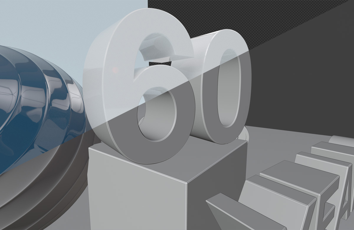
A slight bevel on edges can help to catch highlights and make an image a little more convincing. Nothing in real life ever has perfect, sharp edges!