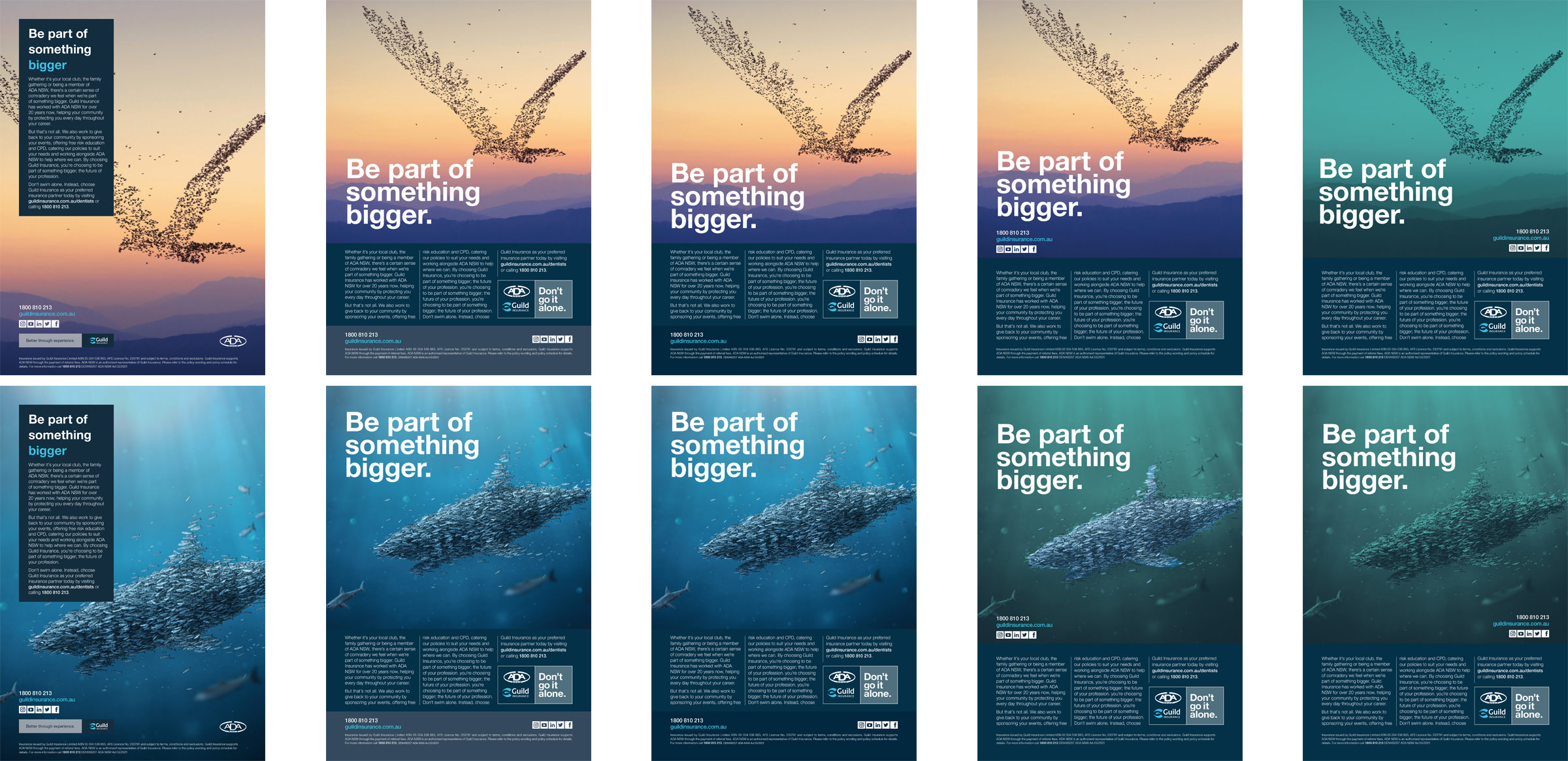
In need of a rebrand, Guild Insurance worked with an agency to bring a new direction. The previous "Better through experience" tag and branding was no longer the message wanting to be sent to the customer, especially after a heavy bushfire season Australia experienced. The agency came up with "Don't go it alone".
Guild Insurance had been using its current style for some time. While we had made minor changes here and there – improving the image choices to avoid 'smiling at camera' style photos and becoming more relaxed and funny in general.
The print digital and video layout style was created by myself and the execution and images were created in conjunction with the other part-time designer in the Marketing department.
Brochure and Ad Redesign
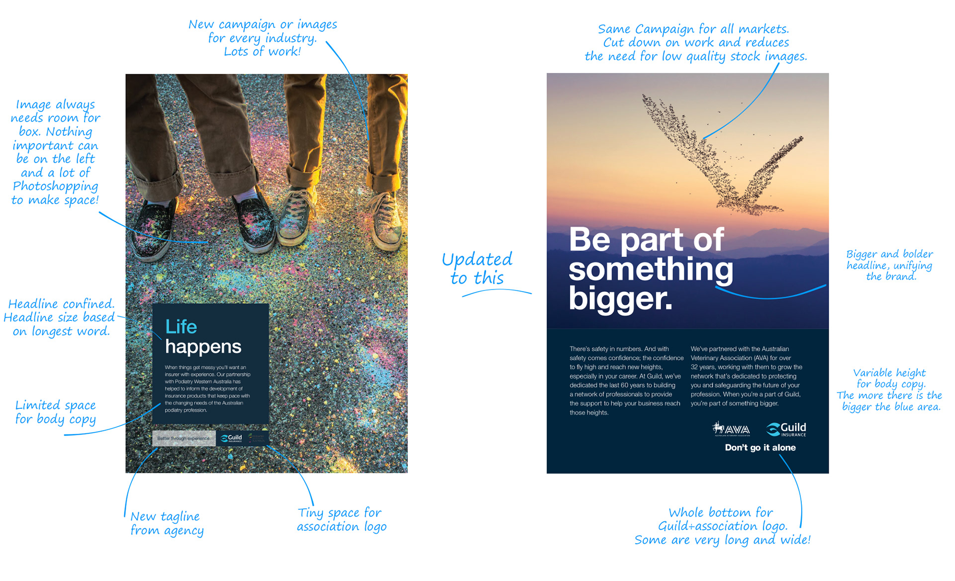
Brochure template created based on our previous style. One of the main problems we had with our previous layout was a restriction on text on the front page. I came up with a simpler layout that meant the amount of text on the front could vary (as comms staff may want more or fewer words than usual).
Brochures


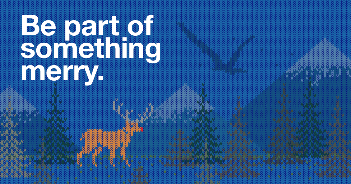
Hero Images
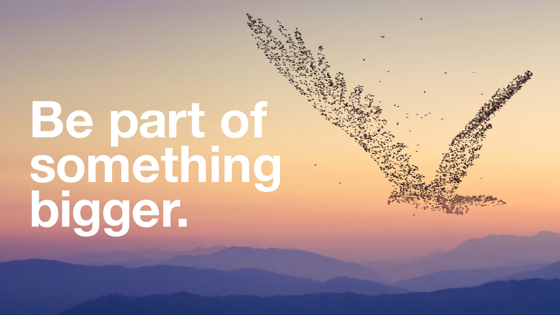
Hero images created for the campaign.
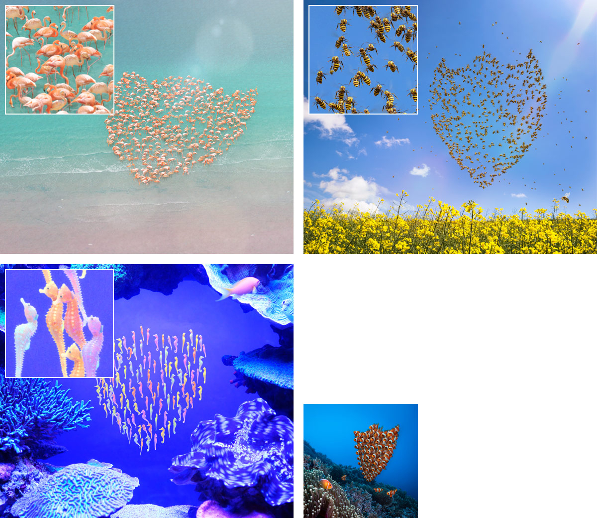
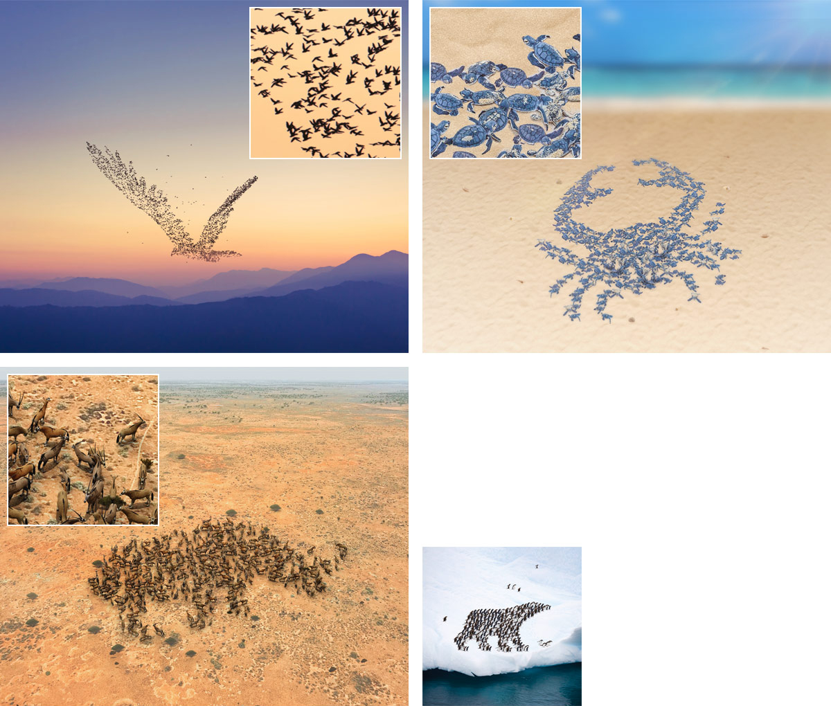
The following year extra images were created, this time based on the shield/protection concept of what insurance is./p>
Marketo eDM Templates
I created a new Marketo template based on the new design. The previous template we were using was created when we first started using the suite, and as they were based on the emails created in a previous system (Vision6) were not taking advantage of all of Marketo's features. The rebrand was a good opportunity to get in direct contact with Marketo and work with them on creating something great. More of the digital work I did for the rebrand can be found here.

Three example eDMs made with my Marketo template
Annual Report

Annual report created for the new style. The report is for the overall Guild Group brand, which includes Guild Super, Acerta, Meridian Lawyers and Guild Insurance (plus a cameo by me and others from Guild, onstage at the 2022 ADMA awards).
Cyber Insurance Brochure

RiskHQ
RiskHQ is Guild Insurance member's window to free clinical and non-clinical CPD and risk material which is available to all their insured customers.
RiskHQ includes targeted clinical and professionals legal case studies, regulatory updates and claims examples to help them identify ways to reduce their professional and business risk, and avoid claims.
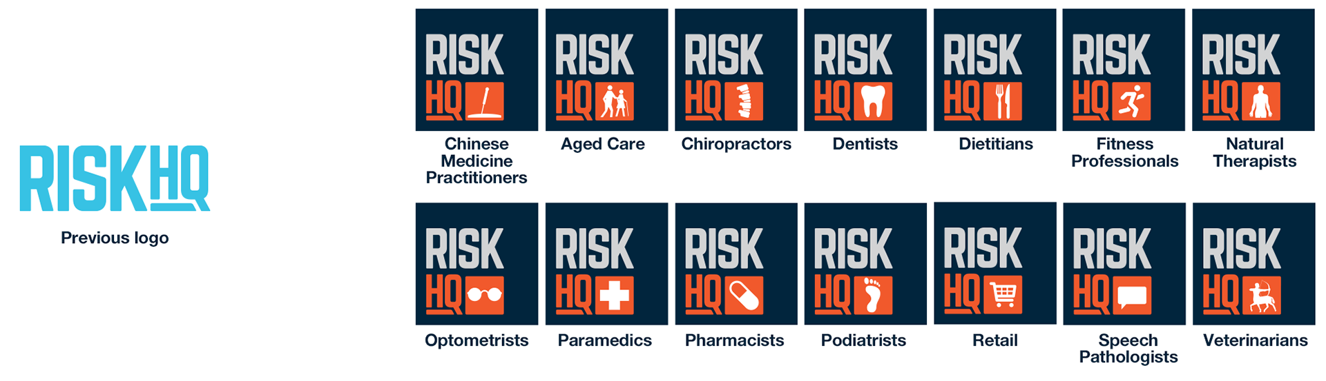
A small update to the RiskHQ logo, themed to each profession we insure. There are more in use, and some will reuse the same image eg. Both Dentists and Dental Prosthetists can use the same logo.


1 and 2-page 'Risk Articles', supplied to customers to help mitigate risky behaviours and situations to avoid having to make a claim, plus some RiskHQ emails.
Extended Executions of Brand
Throughout the years since the "bigger and bolder" style change, it has been put to use in various ways.

The "Growth" theme used at APP 2025.
Another example of the brand at work.
Behind the Scenes
A look at the work before the final style was chosen, and some other tidbits.
Concepts
Progression of the brochure style, which was the first thing worked on after the "Don't go it alone" tag was decided, starting with Guild's previous style on the left.
A gradient map style as tested with the main image, as it was popular in a previous email run we had done, but was dropped in the end as being too restrictive.

As Guild Insurance partners with industry associations they often need a second logo on brochures and other material. Since the logo can take many shapes we have no control over, the partnership logo lockup needs to take this into account. I created a box shaped lockup with the association both inside and outside the box, but in the end it was decided this would not work, and to just have the new "Don't go it alone." tagline to sit under the two logos.
Here we can see the initial concept on the left using a smaller logo, and example of the association logos we use and what would have been a compromise in the centre, and the final decided usage on the right.
The birds were created with a particle system. Since Blender does not let you randomise how far along a particle's animation is, I used a Collection of birds in various stages of flapping their wings, so the larger cluster were not all flapping in unison.
An animation version was created for company-wide internal screensavers, where the birds fly into view over a 3D version of the landscape.
Simple materials were used since the birds would be plain black, and the trees would be blended into the distance fog.
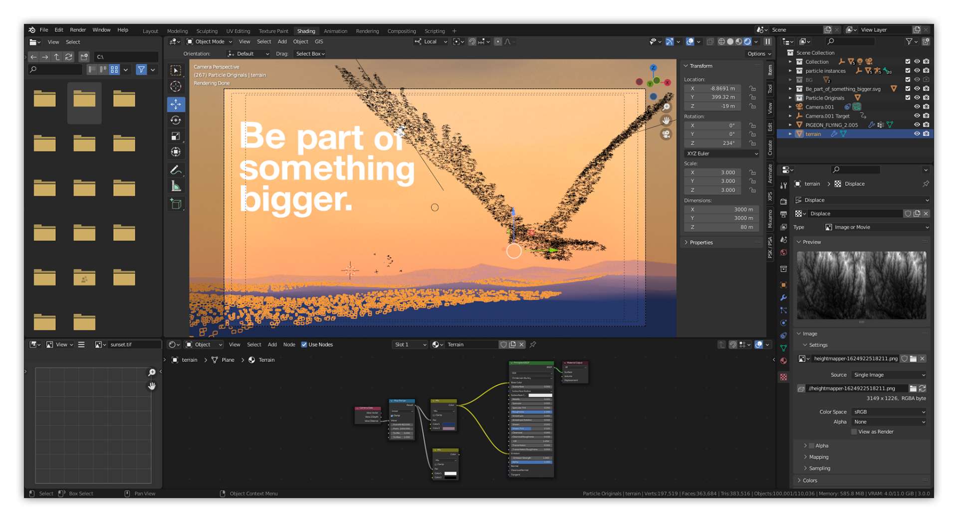
The birds campaign image within Blender.